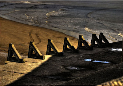
 One of the big things that makes a difference to the first impact of an image is the way it is presented. This is true whatever the image. This photo for example is presented as it is.
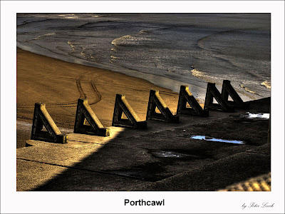
This one isn't too bad, but often if there are a lot of very light areas near to the border they will just get lost when presented on to a white background. The obvious thing to do is to get into a habit of adding a thin black border. Then it would look like this.
Clearly not a major difference but even here it will make the image stand out more on white. Obviously if you were putting the image into a gallery or a page with a black background them you would use a white border.
Both of these effects are easily done by selecting the whole image and then using the "stroke" option (in photoshop it is under the edit tab.) . Depending on the size of the image the storke can be various widths. A small image might only need 1 px while a very big one might be 4 px . Don't forget to choose the right colour and choose the "inside" option in the dialogue box.
You can ofcourse increase the size of the canvass and then use different sized rectangular selections to do this and create a more complex border. This idea can be taken even further and you could produce a personalised style of border where the presentation really starts to make a statement. This is one that I use.
In this case I had a stock image that was the size that I wanted to save the finished image. This was filled with black and my name printed in white using a handwritten font. This was the signature element. I them copied the photograph I wanted to feature and pasted it onto a new layer in the black template image. A text layer was used to print the title of the image in white and the whole lot saved with a new title.
 The same thing can be done with a white template just as easily. as this example shows. In this case becasue it may go onto a white page I added a thin 1 px stroke to the white template layer so that the whole thing is separated from the background white when put on a page.
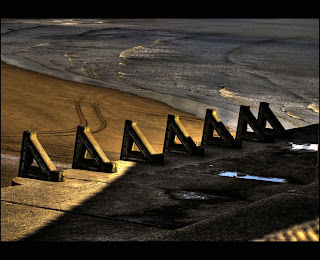
An increasingly popular variant on this is to add a think black strip across the top and bottom of landscape images, such as in this case.
The idea of a white border does not have to be so formal. You could use a mask to give the border effect. In this one, for example I used a template where I had painted a black template onto a white background. This was then pasted into a new layer on the orinigal photo. Set the layer style to "lighten and this is the result.
You can use all sorts of border templates to get the same result. Obviously this will be the opposite if you want a white border - i.e. you create a template with the black on the outside of the border layer. here are some more examples.
Another thing that you can do to create different borders is to create the feeling that the image is on a raised canvass. This is achieve by using the layer style tab and selecting emboss. You can play around with the setting until you get th effect you are after. Here is an example of the effect, but there are lots more variations on this theme you can get by experimenting.
I will just give one final example of things you can try to give you images a different, but "finished" feel. This one was created by selecting a rectangular area of the image and then inversing the selection ( so that it had selected the area outside the rectangle. Then you remove the colour from the selection. Repeating this on another copied layer means you can create double borders.
The good thing about trying to devise a style for your images is that there are lots and lots of variations and yet no "right" one. You just get something that works for you.
Peter Leech
( You can get some examples of border templates to try these ideas out by going here )


No comments:
Post a Comment